Showing posts with label color pencils. Show all posts

Thursday, September 2, 2010

Coloring for Sanity...

I had to take a break and do some coloring yesterday.  I didn't have time. I had plenty of things I should be doing.  BUT sometimes we have to take a well deserved mental break.
It definitely felt like the perfect time to pull out the Copics and thought I might get some practicing in.
So introducing Rainbow Clown. This is a stamp given to me by my friend Karen last year when she sent me all her stamping stuff.  I gave the stamp away because it's not something I would use, but not before I stamped off a couple of images.

It looks like it needs a little more blending on the photo, but in person it doesn't look that bad. I'm still learning and practicing.. :)

Here is another image that I colored a couple of weeks ago. I colored the same image with markers and colored pencils in two different color schemes  just to see how it would look. Can you tell which is which?

Wednesday, April 1, 2009

Color Pencil Class (in real life)

I still don't have a name for my color pencil class. I'm going to Hobby Lobby on Friday to talk too the manager. My former Event coordinator from Michaels is working at HL and evidently has been talking me up so the manager is ready to meet with me. So I need the perfect name for my color pencil class in the next 24 hours. (help??) To refresh your memory of the suggestions already made, click here. Go to the comments of that post.


Randomness...
Sorry about the picture-less post. I haven't taken pictures of any cards that I made last week and this week, I've been doing other things. For one, I almost have my home office re-organized. The moving of the furniture in said office has caused residual pain in my back. Yuck! I've got to remember to get help next time...
Another randomness...
The other boy was at the doctor 2 weeks ago because of a sore throat when an ear infection was discovered. The first antibiotic didn't work because now his ears are bothering him again. We spent 2 hours waiting in the Dr.'s office today. He has a new anti-biotic and I made some new friends. Life is good. Pray that this one will knock out the infection. It took so long and I was in a hurry to get him back to school that I didn't get to the drug store. So I'm headed out now, hoping to get a dose in him before bed.

Now there's a perfect mom. She stops to blog about getting the prescription risking the store closing before she can get there to get it filled before his bedtime...

Tuesday, March 31, 2009

Color Pencil Class ( Artistic Borders)

Finally! That was almost painful! Not quite like labor, but I feel like I just gave birth to something after all the anticipation! I don't even know why I make announcements that I'm gonna do something. I was just looking back to get the supply list and I realized that it's been a month since I announced that I was working on this. OK, enough of that already. It's finally uploaded so lets get started.

My goals today are to show you how I chose to color this image, and to give you a couple of basic tips on coloring. My in-person classes are much more involved, but this will give you some ideas and get you started.

Supplies:
A stamped floral image ( look for an open floral with at least three layers)
Color pencils: 3 blue-greens (or 3 shades from any one color family), 2 greens, and 2 yellows/browns
Glitter

And again to remind you of the specific supplies that I'm using:

Prismacolor Pencils:
3 blue-greens (PC992 Light Aqua, PC902 Aquamarine, PC 1027 Peacock Blue), 2 greens (PC 1005 Limepeel, PC911, Olive Green ), and 2 yellows/browns (Yellow Ochre, PC941 Light Umber)

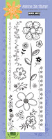
Stamp: Large flower and stem wit leaves from this Hero Arts set (Artistic Borders )
Ink: Versafine Onyx Black
Paper: Georgia Pacific White Card Stock.
Embellishment: Ranger's Diamond Stickles Glitter Glue

~~~~~~~~~~~~~~~~~~~~~~~~~~~
There are three things I want you to remember.

Sharp Pencils: I always start with sharp pencils.
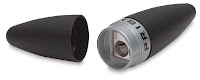
I've been using this pencil sharpener marketed by Prismacolor. I purchase a new one every few months because they get dull. I color a lot so every few months is necessary for me, but replace yours when you feel like it's not sharp anymore.

Light Touch: I almost always use a very light touch when coloring. I once heard a elementary school art teacher describe it to the children as tickling the paper like a butterfly. I feel like I have more control when add a little color at a time, repeating until I get the intensity of color that I'm looking for. Sometimes you will want to increase the pressure to blend or burnish, but for the most part, I use a light touch to apply the color.

Relax and enjoy: This is paper and coloring, not brain surgery. When I color, my goal is to enjoy what I'm doing while hopefully creating something beautiful. I'm not shooting for perfection or realism. My desire is to create interest with my coloring.

Let's keep those three things in mind as we go thru Steps One to Nine.


Step ONE: To get started with this image, I use Yellow Ochre on the center of the flower. I don't worry about coloring all the way to the lines. I'm deliberately leaving white area around the edges because it creates a feeling of depth. Color in all the little shoots/stamen from the flower with this color too.


Step TWO: Add the brown for shading. I'm adding it to the bottom right as if my imaginary light source is to the top and left.


Step THREE: Most of the time I add color in straight lines. Sometimes I add it in a circular motion. This time, using Light Aqua, I actually did both. I colored most of the petal in straight lines...


Step Four: ... until I got close to the end of the petal. I chose a circular pattern so that I could carefully leave just enough of the paper showing thru to create a halo at the end of each petal.


Step FIVE: I took a picture here to show you that I colored the petal lightly first and then went over it again to darken the color. You should be able to tell that some of the petals are darker than the others.


Step SIX: is more repeating, but this time I used the Peacock Blue. The darker the color, the more dramatic the halo appears. Here's a tip for you-- When you are trying to color a flower the same color instead of three shades like I am doing here, make sure there is a variation in color where two layers overlap. You can do this halo, like I'm showing here for the top layer, or simply go over the layer beneath a couple more times to darken it.


Step SEVEN: Color the outermost layer with Light Aqua.


Step EIGHT: Color the leaves and the stem with Limepeel, the lighter of the two greens.


Step NINE: Color parts of the stem with the Olive. Don't completely cover the Limepeel. (Remember we are creating interest, not necessarily shooting for realism.) Add Olive to the parts of the leaves that is closest to the stem. Also color along the center line to shade.


And here it is with the coloring done. Before I actually send it, I'll add a little glitter to it, just in a few spots or maybe even a message. I may even box these up as a set and give them as a gift. -- sometime this century, but if you know my track record, I wouldn't bet on it happening in this decade.
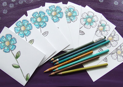

Thanks for coming to class today. If anything isn't clear, email or comment and I'll try to make it make sense to you. Feel free to ask any questions you might have-- about coloring that is. :)

Now that this is done, I am going to concentrate on the video. I'll add it to this post when it's done. Let's hope for some sunshine tomorrow so that I can get good natural light for it.

Q & A

Q~ Judi wanted to know if she could use any color pencils because she doesn't have Prismacolor Pencils?
A~ Sure, you will get the same sort of results with any artist quality pencils. You can also try a less expensive brand such as Crayola or Rose Art, but you may not get the exact same look. You may remember that I did a comparison of color pencils and found that the differences in the pencils were noticeable but minor. For instance, you can do this with technique with Crayola Pencils, but you will have exert more pressure to get the color to transfer to the paper. Artist grade pencils typically have softer leads so you can color with a lighter touch and have the pigment lay down on the paper. Like I mentioned before I feel like I'm more in control with a lighter touch. You can also get a smoother blend with artist grade pencils. You'll see the pencils lines with the less expensive pencils. Try the technique with whatever you have. Personally, I've had Prismacolors for 30 years ( Each time I say that I feel older!) and I'm not sure I could live without them.


Friday, August 8, 2008

May God's presence bring you peace...

The cure for anxiousness... God's presence. CeCe Winans did a CD a few years ago called Throne Room. The first several songs were designed to usher you into God's presence. It's not the kind of music I like to listen to as I'm driving down the road in my van. It's really easy to get emotional and tear up.... not really a good thing when you're driving....

I bought the set with this saying from smARTworks, because I often write that message on the inside of my cards. Sometimes I send a card to someone when whey are going thru a seemingly insurmountable problem, or a death in the family, miscarriage... times when there are no words to say. I wish them peace in God's presence.

So about the card:
If I remember correctly, this is an Anna Griffin image. I colored it when I worked at Michaels in Warner Robins years ago. (It was at least 4 1/2 years ago). I've been thru my already colored images and making decisions and I have a lot more where this came from so. (I think I color too much). I have to thin out my 'collections' to a more manageable amount so I'm giving a lot of them away....


Here is a close up. I didn't do any blending at all. I stamped the image in light gray and then traced around the image with the color pencils (coloring book style) totally covering up the ink.


Do some card making or card sending this weekend. Bless somebody and be blessed! Jacki ;)

Tuesday, March 18, 2008

My Last Class at Michaels

Pictures from my Stamping in Color II class last night. We concentrated on two complicated images. In the intro class they were introduced to several different techniques for coloring with the Prismacolors. I really wanted them to know what they can accomplish with the pencils. This time we colored the multi layered rose and the coloring images on dark papers as you can see in the first 4 pictures.


Stamps used are from the set called Pretty Amazing (Stampin Up). Prismacolors used: Colorless blender pencil, white, Lilac, Parma Violet, Violet, Limepeel, Chartreuse, and Olive.

I didn't start taking pictures until we were almost done, so I am showing you my rose in this last photo . I colored this right along with them last night. You can see how I layer the colors. Stamp used is "Jacki's Rose" ( Raindrops on Roses) Prismacolor pencils used: Colorless Blender, Jasmine, Poppy Red, Crimson Red, Tuscan Red, Chartreuse, Olive, Limepeel.

Monday, March 3, 2008

I'm just thinking out loud.

I decided a long time ago that I don't compete with the talent of others. I do what I do best. That was my position when trying to decide whether or not to begin this blog because there are so many others there.

I've been doing some brain storming with my husband. I have a couple of ideas for my business ambitions. I am definitely going to do the DVD Color Pencil coloring class. Right now, the glitch in my plan involves the booklet that I include with my Michaels class. If I provided a booklet with the DVD, I don't know the legalities of including images so that we'd be coloring the same thing ( like I do in class). Actually, I'm pretty sure that would not be legal, or desired. So maybe I'll include some actual stamps? Maybe my designs? That's going to take a little longer. What if I got a stamp company to sponsor me? Maybe for this century, I'll just try to do the video for the blog.... Too much to think about... brain hurts...


Today has been one of those not only did every thing go wrong days, but nothing went according to plan, and believe me I had a plan. :) I'm going to bed early. I really think I have some hormonal issues going on. I wonder if the menopause thing is getting closer.... ( just in time for my hysterectomy, what's up with that??? )

I do have one of my new favorite cards to show tomorrow or the next day. I'm hoping the mailman will deliver the cards so that I can show you. I've been playing with my Cricut too! Teenage boy cards are the hardest for me, but hopefully I've pulled it off. I need to get a handle on it, because all my babies(nieces and nephews) are now teens or preteens. Time flies!

Friday, February 8, 2008

Mailbox in Red

"The boy" forgot to give the bus driver her Christmas gift. Of course, I sent it in on the last day before Christmas break so there were no second chances. I didn't want to give her an ornament and Christmas music in January so I decided to give her a Valentine's treat. Instead of working at the last minute as I usually do, I was determined to give this to her no later than today. Notice that I said I was going to give it to her. After the fiasco this morning with the Card Castle ceiling, I didn't think I would finish in time, but I made it with about 5 minutes to spare. She is a very sweet lady and I appreciate how good she does her job.

Unfortunately, I didn't have time to do more for her, but I made this mailbox and card for her.
The Hero Arts cupcakes are stamped on the red and white splatter paper and colored in markers on the box. The cupcake is paper pieced on the card. I added glitter to the hearts on each cupcake.

This is a very small gift card sized card ( 2 3/4 x 3 3/4).
The boys are by Penny Black and colored in Prismacolors. The "from both of us" is Biblical Impressions.
I used Real Red Dye ink for both. The Boys were stamped in Walnut Stain Distress ink.


Not that there would be a postage stamp in the mailbox flag, but I used the Stamp Paper edgers and a square punch to make a faux stamp for the flag on this one.

I didn't decorate my candy inside. I bought the ones with the seasonal wrappers. If I were on the receiving end, I wouldn't want to mess up all the prettiness by eating the candy...ok, I would mess up the prettiness, and I would still eat the candy, but I'd feel bad that I messed up the pretty. This way I saved her all the guilt. Isn't that nice of me??


I used the Copic colorless blender to smooth out the pencil lines. I normally use the colorless blender pencil, but I was in a hurry and this goes much faster. You can still see a little of the texture, but it gives it a nice smoothness. The first picture was just coloring and layering colors. I didn't have a brown for their skin down here when I colored it, so I added it just before I blended, but after I took the first picture. You can mainly see the difference in the blue jeans and the red shirt. The lighting was a little different too. Anyway, I love the Copic colorless blender to use with the pencils, but I took back the rest of the markers-- both the Copics and the Prismacolors. I like them ok, but I really do already have -ahem- several markers... no several sets of markers ...actually several hundrends of dollars worth of markers-- that I don't often use. If I started with the expensive ones, I would have to practice a lot and spend a lot of money getting all the colors. I was dying to try it and now I'm over it. I promised my pencils that I wouldn't abandon them. There I go doing another nice thing today.

ETA: I first learned that the Copic Colorless Blender would blend color pencils on another blog Talk to the Ham. I assumed that it would work as good as the Prismacolor marker. It's been several years since I had a Prismacolor Marker blender so I kinda forgot that it didn't work too well. I wanted to try the Copic marker to see how that compares.
I finally got around to trying it and it works great for quick blending. Actually I've played with it just enough to know I liked it and it's quicker than using the colorless blender pencil. I haven't done the water color look, although based on what I did, I'm sure it will work. I don't know how much the refill for the Copic blender marker costs. That's something I'll have to look into. I do know that this could be considered expensive compared to the Gamsol per ounce. But if you are like me you have a room full of tools and supplies for a technique that you may only use once a year, getting the marker vs the OMS and blending stumps is an option. If you are Sue Nelson, and you go thru a gallon of OMS a week, obviously that would be a cheaper way to go.
So far, I like the control with the marker vs the blending stumps. I'm not a big fan of the OMS technique, but to be honest, I didn't practice enough with the blending stumps to really get the hang of it. I'll keep you posted as I practice more.

I need to get back to my dusting and cleaning. Have a blessed weekend!!!

Wednesday, February 6, 2008

Let's Get This Party Started!


Finished Card size:4.25" x 5.5"
Stamps: Background Leaf(Not sure) Party Chicks and Get this Party Started (Hambo Stamps)
Ink: Brilliance Graphite Black(Tsukineko), Real Red and Certainly Celery (SU)
Other: Notched Corner Punch (SU), Circle Punches
Colored with Prismacolor Pencils

I just wanted to play with these birdies. I don't tend to have the kind of gatherings where I would need to make handmade invitations, but wouldn't this be cute? I bought these stamps to design a ready to assemble kit of invitations for my soon to be 11 year old neice. She wants to plan a birthday party and loves to make cards. Her BD isn't until April but I'm going to put together some items for her and get it shipped out really soon.


On a Personal Note:
I'm headed out to lunch with a young lady my husband and I met. I can't wait to tell you about a 'chance' meeting we had a few weeks ago. I'll get her permission and some pictures today. I made a card for her too. I'll show you that then too.

It's rainy and gloomy here, but we are getting rain that we desperately need, so who can complain?

Be blessed today. God has been pointing me to Philippians for the past 6 weeks, so I'll leave you with these verses to encourage you and thank you for encouraging me.

Philippians 1: 3-6
I thank my God every time I remember you. In all my prayers for all of you, I always pray with joy because of your partnership in the gospel from the first day until now, being confident of this, that he who began a good work in you will carry it on to completion until the day of Christ Jesus.

Thursday, January 31, 2008

Coloring Solid Images on Dark Paper

I'm not a real artist (I just play one on my blog) so I'm not going for realism when I color. My goal is variation and interest. I rarely use only one color ( like I showed you yesterday) but I prefer to blend several colors together. Sometimes I get a motley look after I've blended the colors. I like that. Coloring for me isn't difficult, but it is time consuming. The right tools will make a difference.
ETA: speaking of the right tools: I've gotten a couple of emails for clarification. The white pencil and the colorless blender pencil is the only thing need to blend the colors together. -- NO odorless mineral spirits and NO blending stumps. I can only speak for artist grade Prismacolor Premier and other pencils like it.( see my Color Pencil Comparison) You might be disappointed if you use color pencils that are not of this quality.


Supplies needed for this lesson:
Prismacolors Pencils or any wax or oil based pencil (water soluble aka water color pencils will not work the same)

  • Prismacolor Pencils used: White, Colorless Blender Pencil, Olive, Lime Peel, Violet, Parma Violet, and Lilac
  • A smooth quality dark colored card stock -- I used Chocolate Chip card stock from Stampin Up)
  • White Pigment ink-- I used Whisper White Craft Ink from Stampin Up. I've also used Colorbox for this technique. I would imagine that any good white craft or pigment ink will do the trick.
  • A solid rubber stamp. I used a Stampin Up set called Pretty Amazing.

To view the original card click here. I'm working on Mother's Day cards now so this sample I working with is for a 5 x 7 card. When I'm finished making them, I'll post them and link back to this post.

Preparing to color: Stamp the images on the dark cardstock with the white pigment ink. You can mask the main images to stamp the background. I guess you could heat set it, but I've never done that. I ususally stamp the image and go do something else. When I come back later or the next day, it's dry.

For this design, I start off by adding the darkest green (Olive) to the bottom of the leaves.
I try to stay right on the leaves. This first layer of application requires a light medium touch.

Next I add the lighter green(Lime peel) with very little overlap.

Starting with the inner most parts of the flower I add the darkest purple (Violet).

Avoid the lines that define the stamp if possible. Keep your pencils sharp and don't bear down too hard. It's better to add several 'coats' of color than to have one heavy 'coat'.

This is a little blurred, but you can see that I added all three shades of purple. Again don't overlap too much -- that comes later.

I add the white to the tips and blend down towards the flower's center with the blender pencil.

Add more white or more dark and blend until you get a look you like.


Let me know if you have any questions.

Wednesday, January 30, 2008

Cupcake Confession

This post is edited at the bottom.

I bought a set of clear stamps yesterday. I don't like clear stamps. I like wood mounted stamps. I'm an old dog who is very satisfied with my old tricks! It was this cupcake's fault. Actually it was Lisa's fault for showing me the cupcake. Her cards are always fabulous and now she's on the "cupcake" kick. I'm so annoyed with her. And then there's Dawn. She just had to give me directions to Archivers and had the nerve to suggest we meet there yesterday. What's up with that? ?


Now let's talk about why I had no choice but to get the clear set of cupcake stamps and not the wood mounted cupcake set. Everybody gets a little of the blame here-- except me of course. I'm holding Hero Arts responsible for most of the damage. They created 6 of the cutest cupcakes in the world, 5 sayings, and 3 cupcake toppers all in one set of stamps. With a little masking, I can have a candle, a flower, or a cherry on top of the four that don't already have something up there. This set is so versatile. How silly is that?? Each cupcake in the wood mounted set of 4 is what it is. There are two birthday cupcakes, one with a flower and the one with the cherry... It's locked in. You can't be flexible. Back to Lisa. Again, Lisa, made those cute cards. Not that I would duplicate her cards, but why couldn't they have inspired me to go and use the cute little cupcake stamps I already own. But NOooooo. Her designs were so adorable, I had to have the exact same ones. Now let's talk about Archivers. Oh it was worth the almost 1 hour drive to get there. They had the nerve to have the very same set of cupcakes in stock along with a whole wall of clear stamps-- Stampendous, Hero Arts and others. I wouldn't allow myself to look too closely. After all I came on a mission to get those cupcakes. Dawn is to blame too. Dawn, who wouldn't accept no when I tried to decline, gave me a 30% off Archivers coupon (the meanie) so I had to use it on this set. It's a conspiracy, I tell you! This is my story and I'm sticking to it!

What am I afraid of? Staci and Karen might remember the old days when I was a scrapbooker and a card maker --all without the use of rubber stamps, thank you! Karen went to her sister's house in another land (or state) and came back all excited about "rubber stamping". I refused to watch her stamp and emboss. After all, I had seen Carol Duval do it and I was afraid that if I saw it in up close and personal, I would have to have it(all). It took her about 4 months to convince me. I know me. I was sure that if I liked this whole idea of rubber stamping, it would be like Lays Potato Chips, I wouldn't be able to stop at one.( How many times can you color the same image without going nuts?) You've seen my organized stamp room. (--truth is I took pictures on the one day that it was completely organized) If I like clear stamps, I'll have to start a whole new system of organization. I already told you that I don't like new tricks....
You know it's all a mind game I have to play with myself. Stamping is addicting! I have to stop the madness somewhere...even if it's with my own special form of madness! Look out Paper Trey Ink!


Now that I've gotten that off my chest, I'll tell you all about this card.

The Hero Arts heart cupcake was colored with Prismacolor pencils and blended with a Prismacolor colorless blender pencil. I colored the entire heart a very light shade of pink. I used a light color and a light touch. After that I applied the red only to the outer edges. I used the blender pencil in a circular motion to blend the colors together.
The background was created with 1 inch squares of Bazzill Monochromatic textured card stock. I put the entire card through the Xyron. Once the whole front was sticky, I placed my one inch tiles in a predetermined pattern. Finally, I put a 1/2 inch strip where the tiles left off.
ETA: Answers to Kathy's questions. Archivers is more than worth the 45 minute drive. I do like the quality of the Hero Arts clear stamps and I really didn't want to like them.(wink) I'm not crazy about the Studio G clear stamps I bought from the $1.00 bin at Michaels . To be fair, I only tried two sets, but I had a hard time getting a clear impression with them. I do have clear stamps that I bought years ago, maybe 5 or 6 years ago from Diakonos stamps before clear stamps were wildly popular. The problem is I don't use them because they are in a drawer marked "Acrylic Stamps". All my other stamps are stored by theme. I do have a problem with the smell. I can't wait for that to go away. It really makes me nauseated.
--And another note. It's not just clear stamps that I don't like. It's anything unmounted. I like mounted stamps because I already have a system for organizing.
Deb, I'll let you know the next time I'm headed to Archivers. Maybe I can pick up something for you?

Tuesday, November 13, 2007

Color Pencil Comparison (part 2)

This it Part Two. Click here to go to Part One

My colorful history.
I've been coloring long before I was stamping. I bought my first Prismacolor pencil in 1979 for 40 cents each in the art department at Gimble's Department Store. I think I started with 3 or 4 and added to my collection as often as a jobless teenager could. Actually there were two brands for sale. Eagle Prismacolor and Venus Spectracolor. I tried them both, but even then I preferred the Prismacolor brand. Finding those pencils changed my opinion of coloring. I never liked to color before then. I hated crayons and coloring books. The only color pencils I knew of had two colors in each barrel, one on either end. Does anyone else remember pencils like this? and they had very hard core were difficult to color with. I think they were made for drawing or labeling maps or something like that.

Colored with Prismacolor Premier Color Pencils (Stamps by smARTworks)
printed background paper( Thomas Kincaidcollection)

I was genuinely impartial on my fact finding mission, because I did it for my own curiosity. But, I was excited to prove that Prismacolor Premier Pencils ranked among the best-- in my opinion! Knowing that the Blick "store brand" was equal to Prismacolor in every test, gives me permission to try more colors of other brands, something I hadn't even considered before. I also I am also happy to say that I discovered a whole new "different" love.

colored with Lyra Rembrandt Polycolor Oil-Based Colored Pencils
(rose leaf stamp by Rubber Stampede,rose and saying by smARTworks)

The Lyra pencil is quality pencil at a comparable price. They are not quite as soft as Prismacolor, but even that has it's benefits. The points don't break as easily, so it's easy to maintain for detailed coloring. They too have a colorless blender made specifically for their pencils. The only problem I have with them is there was no purple in the 24 set. How can you not have a best secondary color in a whole pack of 24 pencils? You know what that means don't you? I have to buy the bigger set*! I also like the quality of Faber-Castell. But, at some point, I'm going to have to stop buying pencils.

*I did check out the larger set and there are no purples in it either. I wonder if purple isn't a color that they can achieve that light fastness standard. The Lyra brand has a higher light fast rating on some of the colors. The Light Fast line of the Prismacolor pencils only had one color even remotely close to purple in the entire 48 color set. I would also like to know where the Stampin' Up color pencils rate among the "artist quality" brands. But, I'll have to save that curiosity for another day.

Prices and Availability
Another observation from my quest. Shop around because prices vary tremendously sometimes even within one store or chain. I went to several Hobby Lobby stores in the course of this search. Because they don't have bar codes and scanners, everything has a price sticker. Evidently there was a price increase because there were pencils on the shelves with different prices. For instance, that pack of 24 Lyra pencils was marked 24.99. The one behind it was 21.99. Of course I picked up the cheaper one and used my coupon. I also purchased a set of water soluble ink pencils in one store at $15.99 and another store the same set was $19.99.

Again, I love it that Prismacolors has the most colors and are available everywhere, from Office Depot to Staples to Michaels and Hobby Lobby. (by the way, Hobby Lobby has an online store now, Crafts Etc.) Hobby Lobby and Michaels have 48 colors open stock. Dick Blick sells all the colors open stock and sets and their prices are significantly less than the big stores. There are other online art supply sites, but I cannot recommend them personally. If you have a personal recommendation post a link in the comment section and I'll add the links to the bottom of this post.

My conclusion: Use what you have. The pencils I tried for the most part are all good. For some it was like comparing oranges to tangerines. While there are some differences, either would get the job done. If you're looking for a recommendation because you don't have any good color pencils, I would definitely recommend Prismacolor, for the quality, availability, color selection, and price.

Different Colors Available
Prismacolor Premier Colored Pencils ~132,
Faber-Castell Polychromos Pencils ~120
Caran d'Ache Pablo Colored Pencils ~120
Blick Studio Artists' Colored Pencils ~ 72
Derwent Coloursoft Pencils ~72
Derwent Artist Pencils ~72
Prismacolor Premier Lightfast Colored Pencils~ 48
Lyra Rembrandt Polycolor Premium Oil-Based Colored Pencils ~ 36


I don't know what I'm going to do when I start teaching the Water Coloring for Stampers class.....

Friday, November 9, 2007

Color Pencil Comparison (part 1)


Before we get started, here are my disclaimers:


  • If I recommend a product here, it's simply because I love it.

  • I'm not representing anyone.-- I don't have time to represent anyone-- but me ;).

  • This blog is here only for the stated reason in my introduction. --It's a glimpse into my life thru my card making.

  • I have no desire to be on a design team. As much fun as it looks like it would be, I have to be honest with myself, I don't have the time in my life right now. Yes,I realize that means I'm potentially saying "NO" to getting free rubber stamps... (sigh)


The reason for this experiment ~
or why I'm suddenly obsessed with every color pencil on the market.

I began teaching my first coloring class here at Michaels by proclaiming that Prismacolor pencils were the best color pencils on the market. I had to quickly add "that I've tried". After a week or so of toying around with the idea of trying other pencils. I thought, "Should I spend money to purchase other color pencils when I'm perfectly happy with what I have? What will I do with the pencils I don't like? Who else cares?"

I looked around on the Internet for info and even asked for opinions on the Gingerwood Rubber Stamping Board. It was then that I decided that I really needed to see for myself. ----

--which brings me to this experiment and this post.

~~~~~~~~~~~~~~~~~~~~~~~~~~~~~~~~~~~~~~~~~~~~~~~

Test One and Test Two:

The paper, my control variable, is Georgia Pacific White Card stock for the Coloring and Blendablilty tests. ( I realize that blendability isn't in the dictionary, but it should be!)

I tested 11 brands/types of Color pencils... I had to stop somewhere...All the pencils are regular color pencils-- not water soluble or water color pencils.

~~~~~~~~~~~~~~~~~~~~~~~~~~~~~~~~~~~~~~~~~~~~~~~~~~~~~~~~~~~~~~
Test One: Coloring

I based this test on how easy it was to cover an area of the paper. If you've ever used Prismacolor Pencils, you know that they core is very soft and it doesn't take much effort at all to transfer the color to the paper. I also considered how easily the pencil reacted to various amounts of pressure. Some pencils no matter how hard or soft I colored, the color didn't vary at all. I like to be able to achieve different shades of the same color just by varying the amount of pressure. The colors are listed under the following rating for this test.


The eleven brands were rated on a scale of 1-5

5 = as good as Prismacolor /4 =almost as good, definitely interchangeable /3= too much work/2= give them to the kids/1= waste of money


5 ~Prismacolor ~Dick Blick's Brand

4 ~Lyra~Faber Castell ~Derwent Color Soft

3 ~Prismacolor Lightfast (this surprised me, but it varied by color) ~Derwent Artist ~Pablo Caran d' Ache

2 ~Ek Sucess memory pencils ~Colorific ~Crayola


~~~~~~~~~~~~~~~~~~~~~~~~~~~~~~~~~~~~~~~~~~~~~~~~~~~~

Test Two : Blendability

  • with the pencils

5 ~Prismacolor Lightfast~Prismacolor~Dick Blick's Brand~Derwent ColorSoft
4 ~Lyra~Faber Castell~
3 ~Pablo Caran d'Ache
2 ~Derwent Artist
1~ Ek Sucess memory~ Colorific ~Crayola

~~~~~~~~~~~~~~~~~~~~~~~~~~~~~~~~~~~~~~~~~~~


For the next two tests, the brands were rated at follows: 3 = affected by/ 2= not so much/ 1= wasn't affected at all


  • with a blender pencil

3 ~Prismacolor~Dick Blick's Brand ~Faber Castell~Derwent Artist
2 ~Lyra~Derwent Color Soft~Prismacolor Lightfast ~ EK Sucess Memory~
Pablo Caran d' Ache

1 ~Colorific~Crayola

~~~~~~~~~~~~~~~~~~~~~~~~~~~~~~~~~~~~~~~~~~~~~~~~

  • with Odorless Mineral Spirits


3~Prismacolor~Dick Blick's Brand ~Faber Castell~Derwent Artist~Lyra~Derwent Color Soft~Prismacolor Lightfast ~ EK Sucess Memory~Pablo Caran d' Ache
2 Colorific~Crayola

~~~~~~~~~~~~~~~~~~~~~~~~~~~~~~~~~~~~~~~~~~~~~~~~~

Test Three: Opacity and Vibrancy on dark paper

5~Prismacolor ~Dick Blick's Brand
4 ~Lyra~Faber Castell ~Derwent Color Soft
3 ~Prismacolor Lightfast (this surprised me, but it varied by color) ~Derwent Artist ~Pablo Caran d' Ache
2 ~Ek Sucess memory pencils ~Colorific ~Crayola

Click here for Part TWO ~ my observations and conclusion